


What Makes a Font Easy to Read?
Before we list specific fonts, let us look at what makes a font readable. Some fonts are just easier on the eyes than others.
The easiest font to read usually has these features, according to typography research:
-
Large x-height: This is the height of lowercase letters like "x". Taller x-heights make letters easier to see, especially on screens.
-
Open counters: This is the enclosed space in letters like "o" or "e". Open counters keep letters distinct.
-
Clear letter shapes: Letters like "I" (capital i), "l" (lowercase L), and "1" should look different from each other. Avoid fonts where these characters are confusing.
-
Adequate spacing: There should be enough space between letters and lines. The U.S. Department of Health and Human Services recommends a line height of 130% to 150% of the font size for body text.
-
Good contrast: Dark text on a light background is usually the most readable for most people. However, some research suggests light text on a dark background can sometimes improve reading speed.
The U.S. Department of Health and Human Services notes that if a font looks hard to read, it probably is. A good readable font should not call attention to itself.
How-to Solutions: Change Font in PDF Easily
PDF is an uneditable file format, thus making it hard to change the PDF font. Check out how to change the font in a PDF in this post.
READ MORE >What Does the Research Say About the Most Legible Fonts?
Recent research gives us some interesting insights into most legible fonts. A 2024 study from ScienceDirect analyzed three common typefaces (Roboto, Helvetica, and Georgia) and a new one called Optotipica.
The findings were clear:
-
For uppercase letters, Helvetica scored the highest legibility among the typefaces tested.
-
For lowercase letters, a specially designed font (Optotipica) performed best.
The study also found that Helvetica shows high legibility across both lowercase and uppercase, making it a consistent choice.
However, another study from the Nielsen Norman Group found that no single font is best for everyone. In a reading-speed study with 352 participants, Garamond had the highest average reading speed at 312 words per minute. But it was not the fastest font for every reader. People read 35% faster in their fastest font compared to their slowest one, and factors like age affected which fonts worked best.
A 2025 review article in the journal Ergonomics concluded that there is no such thing as the most legible typeface, as legibility varies depending on the reading situation.
3 Easy Ways to Find Font from PDF: Desktop & Online Font Finders
Dig into the three simple ways in this post to find fonts from PDFs. We'll show you the desktop and online font finders to help you identify fonts.
READ MORE >Serif vs Sans-Serif: The Best Fonts for Print and Paper Forms
You have probably heard the terms serif and sans-serif. Which one is the best font for readability? The answer depends on where you are reading.
Serif fonts have small decorative strokes at the ends of letters. Think of fonts like Times New Roman or Garamond. The U.S. Department of Health and Human Services recommends serif fonts for extended amounts of text in print materials.
Sans-serif fonts do not have these decorative strokes. Think of fonts like Arial or Verdana. A 2024 study on typography in print and digital design found that serif fonts are preferred for printed materials because they do not tire the eyes, while sans-serif fonts are more commonly used on digital platforms because serifs can make reading on screens more difficult.
For best font for online reading, sans-serif fonts are generally the safer choice.
How to Embed Fonts in a PDF in 3 Easy Steps
Embed fonts in PDFs to make them look the same when viewed from any other devices. Check this and follow 3 easy steps on how to embed fonts in a PDF.
READ MORE >Best Fonts for Print (Books, Magazines, Reports)
If you are designing something for print, here are some of the best fonts for print. These serif fonts have stood the test of time.
Garamond
Garamond is a classic serif font with a refined, elegant look. It had the highest average reading speed (312 WPM) in the Nielsen Norman Group study. It is often considered one of the best reading fonts for books.
Palatino
Palatino is another old-style serif font with a large x-height, making it readable even at smaller sizes. It is a common choice for books and catalogs.
Georgia
Georgia is a serif font designed specifically for screens by Microsoft. It also works well in print with strong, sturdy strokes. It is often recommended by accessibility experts.
Cambria
Cambria is part of Microsoft's ClearType Font Collection. It was designed for on-screen reading but also prints beautifully.
Times New Roman
Times New Roman is one of the most well-known serif fonts. The U.S. Department of Health and Human Services recommends it for PDF files.
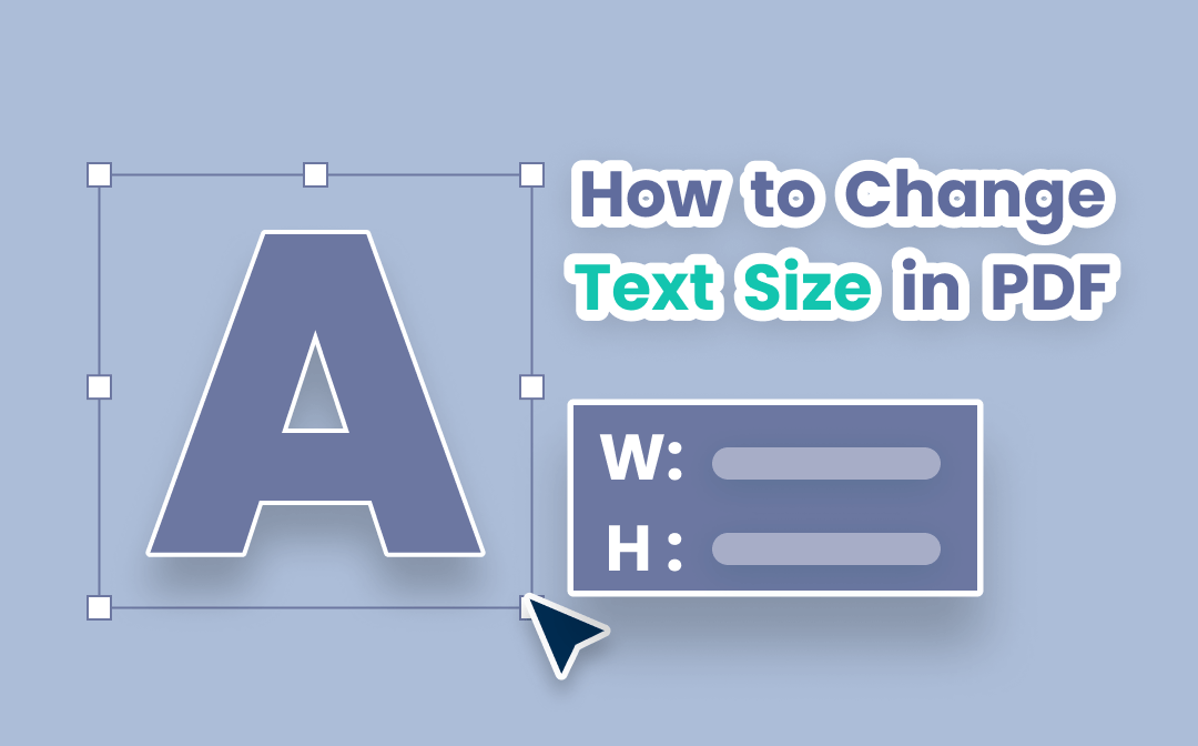
3 Easy Ways to Change Font Size in PDF
A uniform font size in a PDF can enhance readability. Learn how to change the font size in a PDF easily.
READ MORE >Best Fonts for Screen (Websites, PDFs, Mobile)
For digital content, you need fonts that are easy to read on screens. Here are some of the best font for reading on screen options.
Helvetica
Helvetica scored the highest for uppercase legibility in a 2024 scientific study. It is a clean, neutral sans-serif font. It is widely used in branding and digital design.
Verdana
Verdana was created by Microsoft for screen reading. It has a large x-height and wide spacing. The U.S. Department of Health and Human Services recommends it for PDF files.
Arial
Arial is one of the most common fonts in the world. Its clean, simple design makes it a safe choice. The U.S. Department of Health and Human Services recommends it for PDF files.
Calibri
Calibri is the default font for many Microsoft applications and is considered a most legible font option for screens.
Open Sans
Open Sans is a popular open-source font commissioned by Google. It has excellent readability on web and mobile interfaces.
Easiest Font to Read for Speech Presentations
Sometimes we choose a design format for a highly specific workspace scenario, such as standing at a public podium. Selecting the easiest font to read for speech scripts means choosing bold, widely spaced letter lines.
When you are looking at your lecture notes under dim stage lights, you need to know what font is easiest to read at a distance. Clean choices like Helvetica allow you to glance down and instantly catch your next talking point. Furthermore, using clear, easy to read fonts helps team members who manage learning hurdles like dyslexia, making your workplace assignments more inclusive for everyone.
Accessible Fonts for All Readers
When choosing the best font for reading, it is important to consider accessibility. Some fonts are designed to be easier for people with visual impairments or dyslexia.
The U.S. Department of Health and Human Services unofficially recommends the following fonts for PDF files: Times New Roman, Verdana, Arial, Tahoma, Helvetica, and Calibri. These are considered basic fonts that are widely available and legible.
For people with dyslexia, avoid fonts with mirrored letterforms (like "dbpq" reflecting each other) and fonts where "I", "l", and "1" look identical. The "Il1 test" is a simple way to check this.
Some specialist typefaces like Dyslexie and OpenDyslexic have been developed for dyslexic readers. A study found that participants who required learning support processed Open Dyslexic three times faster than Times New Roman.
Fonts to Avoid for Reading
Not all fonts are good for body text. Here are the types to avoid when you need easy to read fonts.
-
Decorative fonts: Designed to be eye-catching but often unprofessional and distracting.
-
Script fonts: Look like handwriting with elaborate swirls that blur together.
-
Narrow or condensed fonts: Squeeze letters together, making text feel cramped.
-
Extremely light or thin fonts: Hard to see, especially on screens.
If a font looks hard to read, it probably is.
Tips for Choosing the Best Font for Your Project
Here are some practical tips to help you choose the best font for readability for your specific project.
Consider the medium:
-
For print, serif fonts like Garamond or Georgia are often a good choice.
-
For screen, sans-serif fonts like Helvetica, Verdana, or Arial are generally more readable.
Think about font size:
-
Use at least 12 points for printed materials.
-
Use at least 16 pixels for web content.
-
For presentations, use at least 18 points.
-
Older readers will need larger type than younger ones.
Limit the number of fonts:
-
Use no more than two or three different typefaces in a single piece of material.
Left-align text:
-
Avoid justified alignment, which can create uneven spacing.
Avoid all caps:
-
Text in all capital letters is harder to read.
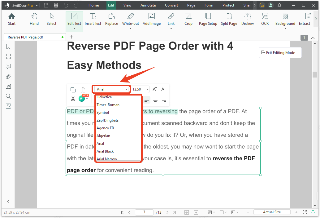
How to Optimize Your PDF Reading Experience with SwifDoo PDF
Even when we know the top typography strategies, many downloaded files arrive locked with tiny, uncomfortable lettering. If you are stuck reviewing a document with bad styling, using SwifDoo PDF for editing allows you to customize the best reading font layout.
Instead of struggling with bad layouts, you can activate the built-in Read Mode to adjust backgrounds to soft Sepia or Dark Mode. If the file is fully editable, you can use the editing tool to swap the text into the best fonts for reading directly on your desktop. By picking your favorite best reading font, you can manage massive work packages without straining your vision.
Step 1: Download and install SwifDoo PDF viewer and launch it.
Step 2: Open your PDF file and click Edit Text > Edit Text in the Edit tab.
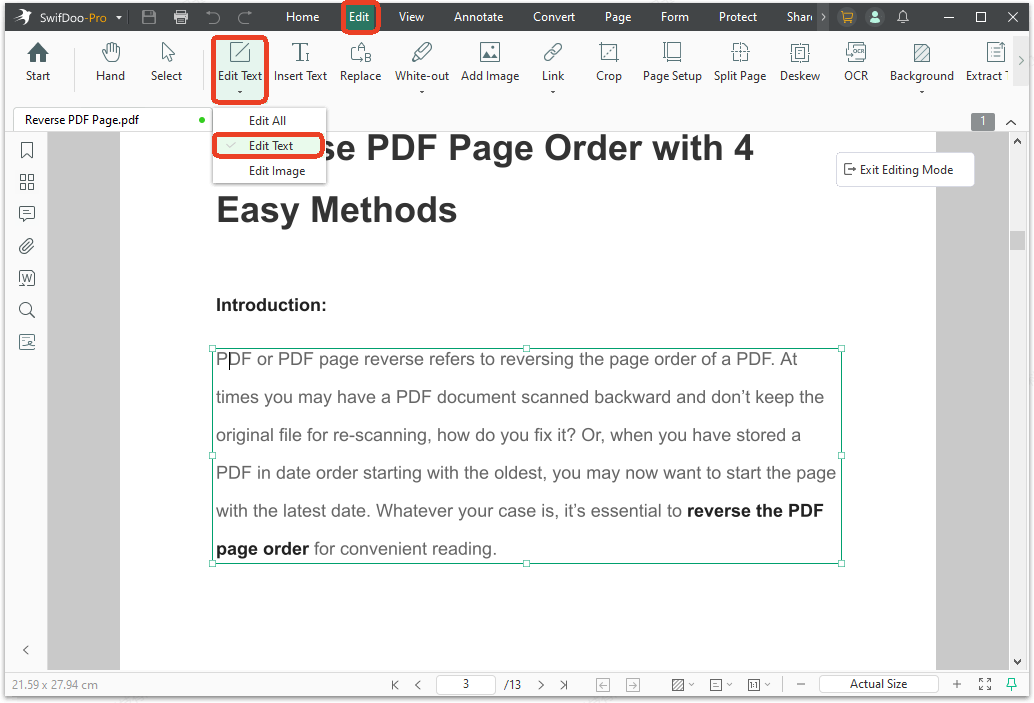
Step 3: Select the texts you want to change and you'll see an editing box show up.
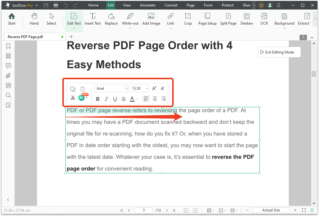
Step 4: Choose from the Font drop-down list and select a desired one.
Font Embedding and PDF Compatibility
Once you have chosen your fonts, you need to make sure they display correctly in your PDFs. Fonts that are not embedded may cause missing text issues.
What is font embedding?
Font embedding means including the font file inside your PDF. This ensures the document looks the same on any device, even if that device does not have your chosen font installed.
How to check embedding?
-
Check the font's End User License Agreement (EULA) to see if embedding is allowed.
-
When creating a PDF, look for an option to embed fonts in your PDF software.
-
Test your PDF on multiple devices to ensure fonts display consistently.
Final Thoughts
Finding the best font for reading depends on your medium and your audience. For print, consider serif fonts like Garamond. For screen, consider sans-serif fonts like Helvetica or Verdana. Research shows that no single font works best for everyone.
Now you know what makes a font easy to read and which fonts are considered most readable. When you need to create or manage documents with your chosen fonts, a tool like SwifDoo PDF can help you make sure your formatting stays consistent across devices.